

In the compelling world of interior design, the impact of color is a subject as deep as the hues themselves. Tint, shade, and tone sing a visual symphony that influences our emotions and behavior, often without us realizing it. Nowhere is this impact more noticeable than in the realm of wall art, where color’s psychological power reigns supreme.
Choosing Your Wall Art
Wall art, while largely subjective, requires some consideration to harmonize with your interior spaces. Picking the appropriate palette is critical. The selected spectrum should not only accentuate the aesthetic appeal of your space but also elevate your emotional well-being. A tactful approach to this selection process involves a careful study of color psychology. Color psychology is a branch of study that explores how various hues impact our emotions and behaviors.
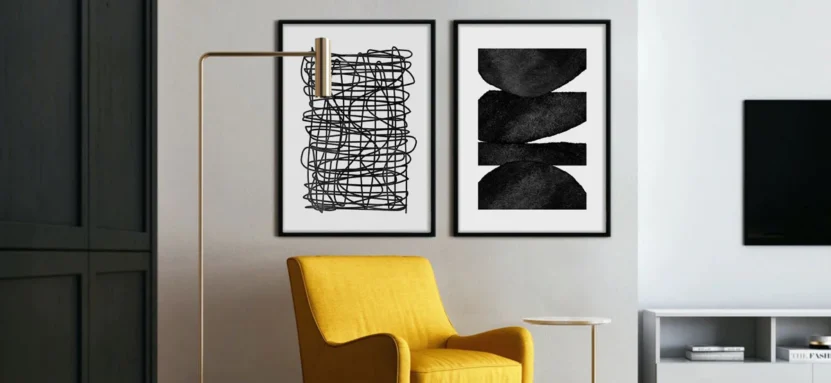
This subject may seem complex, but understanding the basic concepts can revolutionize your wall art selection process. For example, warmer colors like red and orange evoke feelings of warmth and comfort, while cooler tones like blue and green radiate tranquility and freshness. Whatever the design of your piece, Stone And Gray has great framed wall art to pick from.
Calming Hues: Enhancing Relaxation and Serenity
Shifting the focus to individual colors, let’s first explore those soothing to the senses. Blues and greens, associated with nature’s most tranquil elements, water, and vegetation, bring a sense of peace and relaxation. When incorporated into wall art, they create a serene ambiance, making them ideal for spaces like bedrooms or meditation rooms.
Muted shades like pastel blues, mint greens, or even gentle pinks can create a soothing sanctuary. Such schemes offer visual softness, fostering an environment conducive to unwinding and relaxation. Keep in mind, however, that the effect of these colors could vary based on the intensity of the shade and the surrounding elements in the room.
Boosting Mood and Productivity
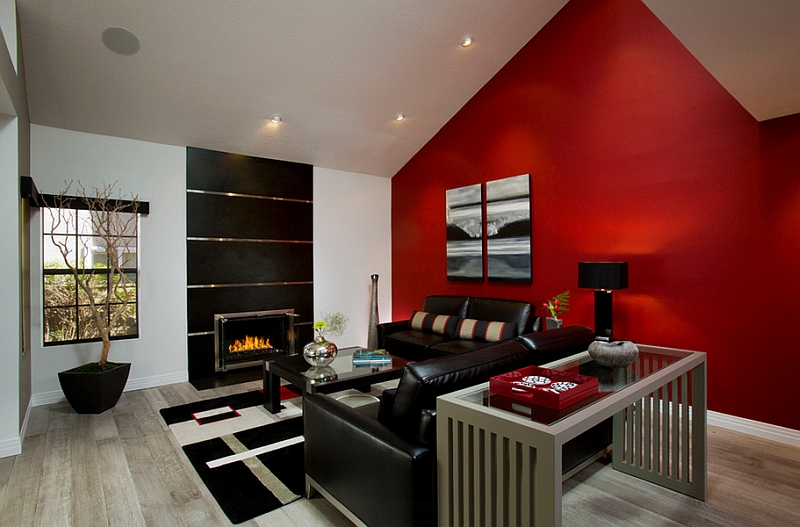
On the opposite side of the color wheel, we find our energy boosters. Reds, oranges, and yellows are innately warm and inviting. Vibrant artwork embracing these shades can spark a sense of invigoration and enthusiasm. Think about including these varieties in living rooms or areas intended for socializing.
Yet, another dimension emerges when these hues are incorporated into workspace wall art. They can stimulate alertness, attentiveness, and energy, potentially enhancing productivity. However, excessive use of these strong colors can also trigger stress and agitation. Therefore, moderation is key when you intend to energize your space.
What Inspires Creativity and Imagination?
Can color spark creativity? The answer lies in the realm of purples and yellows. Purple, a blend of calming blue and energetic red, is traditionally associated with wisdom, creativity, and mystery. In wall art, it can stimulate a rich imaginative realm, making it an inspiring choice for study rooms or creative workspaces.
Yellow, the color of sunshine, is similarly linked with happiness, optimism, and mental stimulation. Incorporating this into your wall art can promote a sense of intellectual curiosity and creativity. These colors are not just for adults – they can be wonderfully inspiring in children’s rooms too, fostering an environment of playfulness and imagination.
Creating Balance and Harmony with Combinations
Harmonious combinations can evoke a sense of balance and peace within a space. This principle is the core of color theory, which studies how different colors interact with each other. Employing this understanding can elevate your wall art from mere decoration to an immersive visual experience.
For instance, analogous colors, those lying next to each other on the wheel, tend to create a sense of harmony and unity. A wall art piece utilizing blue, green, and yellow shades could be calming yet subtly energetic. On the other hand, complementary colors, positioned opposite each other on the wheel, offer a vibrant, dynamic contrast that can add visual interest to your space.
Cultural Influences on Perception
Cultural factors significantly shape how we perceive color. For instance, white may symbolize purity and innocence in some cultures, while in others, it represents mourning. Understanding these variations can enhance the emotional resonance of your wall art, especially in multicultural spaces.
Asian cultures, for instance, associate red with luck and prosperity, making artwork of this color an auspicious choice. In contrast, Western cultures often link red to love and passion, invoking an entirely different emotional response. Exploring these cultural dimensions in perception can guide you in creating a space that feels emotionally resonant and inclusive.
Personal Preferences and Psychology
Beyond universal associations, personal preferences play a crucial role in determining our emotional response to color. Your favorite color may stimulate feelings of happiness and comfort. Incorporating it into your wall art could make your space feel more personalized and satisfying.
If you are fond of teal, for instance, having artwork with dominant teal elements could create a more meaningful connection. Even if the color isn’t traditionally associated with the mood you want for the room, your connection to the color takes precedence. After all, the ultimate goal of interior design is to create a space that makes you feel at home.
Evoking Specific Emotions
Specific emotions can be invoked by leveraging the power of colors. A strategically chosen artwork can set the desired emotional tone of the room. An orange-themed art piece in the dining area could foster a warm, welcoming atmosphere, while a green landscape in the bedroom could imbue serenity.
Equally, consider how an art piece’s dominant color relates to its subject matter. An abstract piece that uses red, for instance, may evoke feelings of intensity and passion. In contrast, a seascape painted in shades of blue and green may instill a calming, peaceful vibe. The connection between color and subject matter can strengthen the emotional impact of your wall art.
Final Thoughts
Color in wall art wields considerable influence over our moods and emotions. In choosing the right hues, consider not just the aesthetics, but the psychological impact they may have. A thoughtful blend of universal color associations, cultural interpretations, and personal preferences can create a living space that nourishes your spirit.